CSUSB Student Union Floor Map Redesign
Client: San Manuel Student Union (SMSU)
Role: Lead Graphic Designer
Timeline: 2025
Tools: Adobe Illustrator
Focus Area: Event Marketing Design, Digital & Print Media, Promotional Campaign, Community Engagement, Social Media Marketing
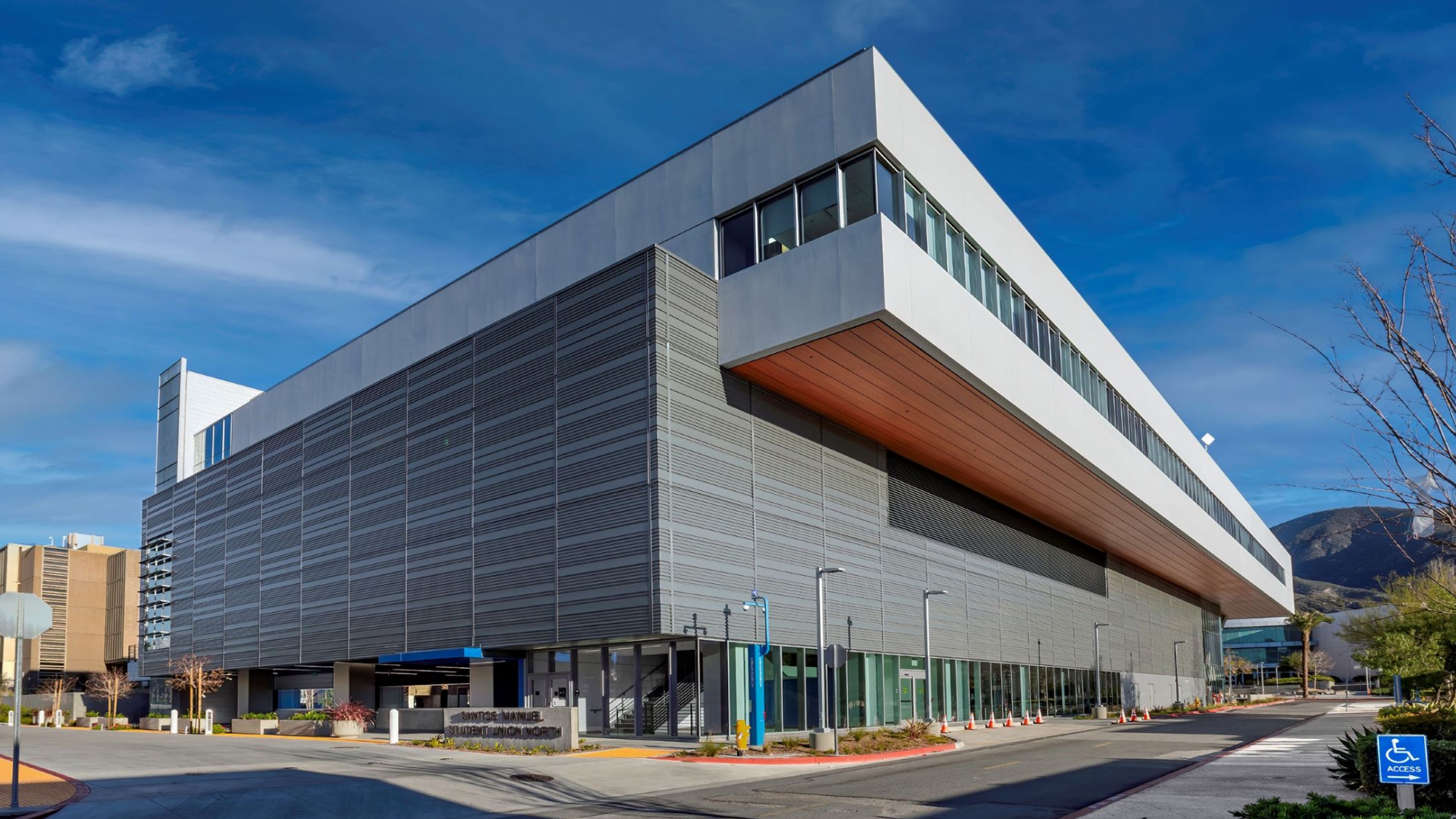
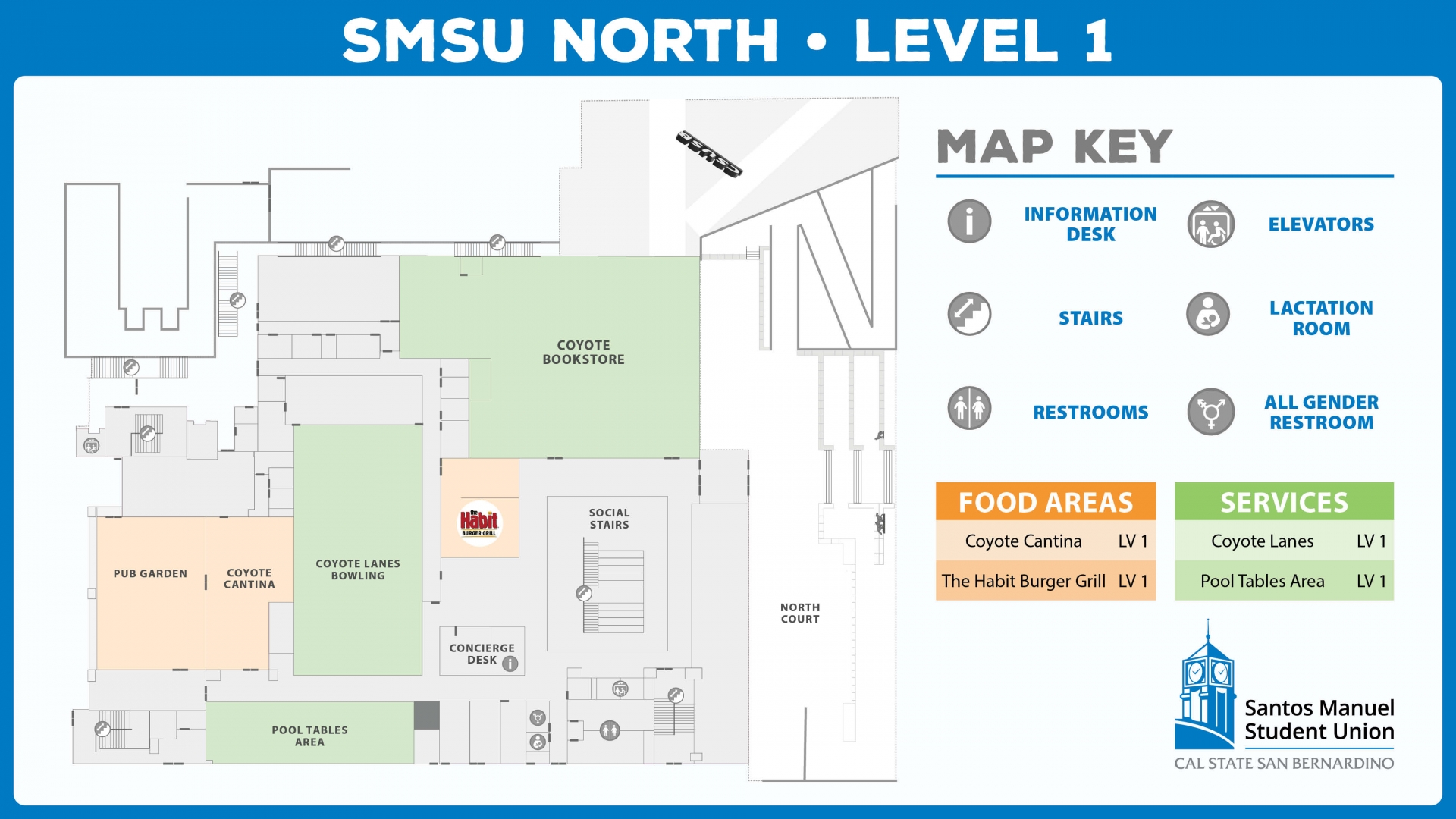
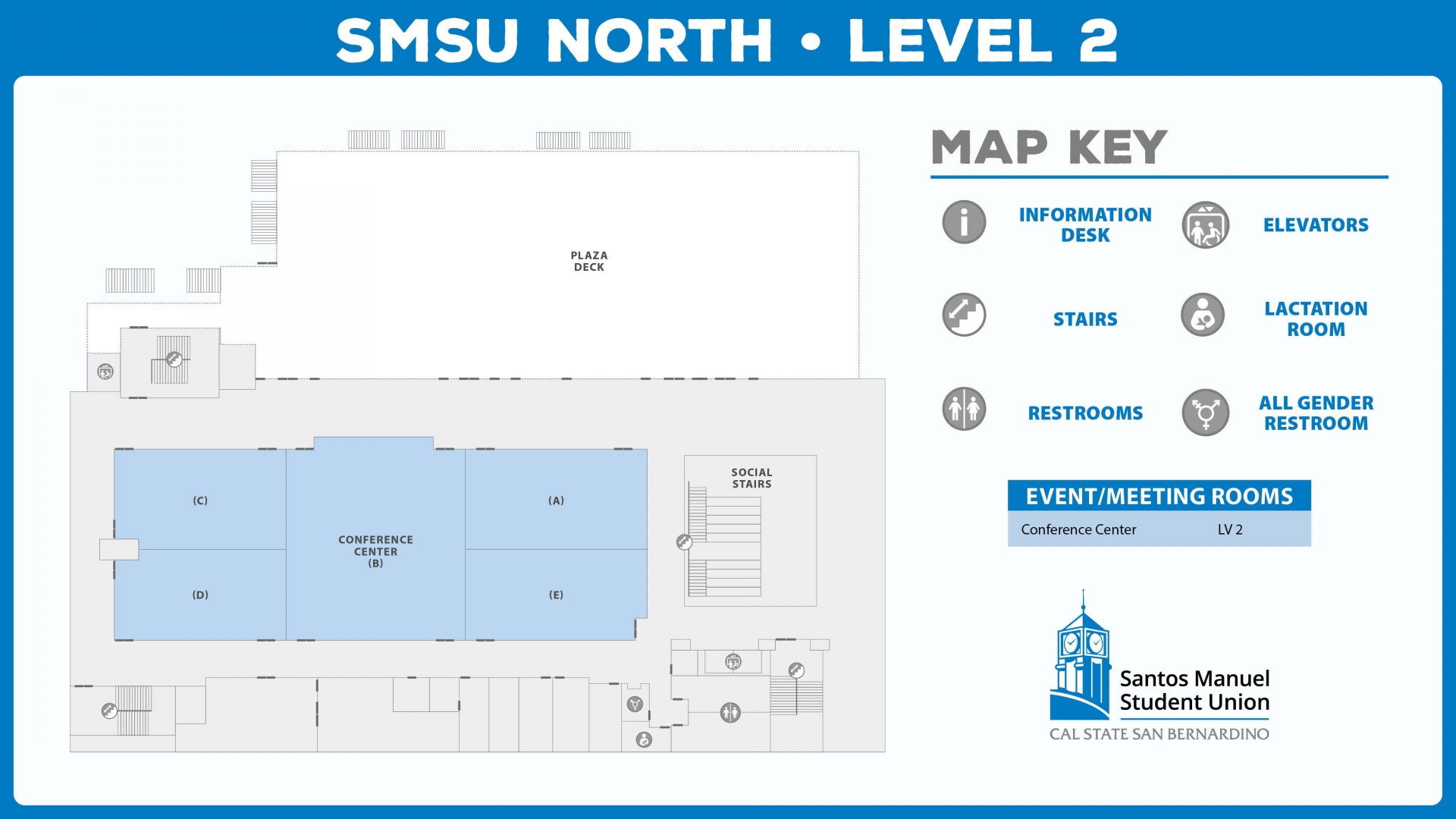
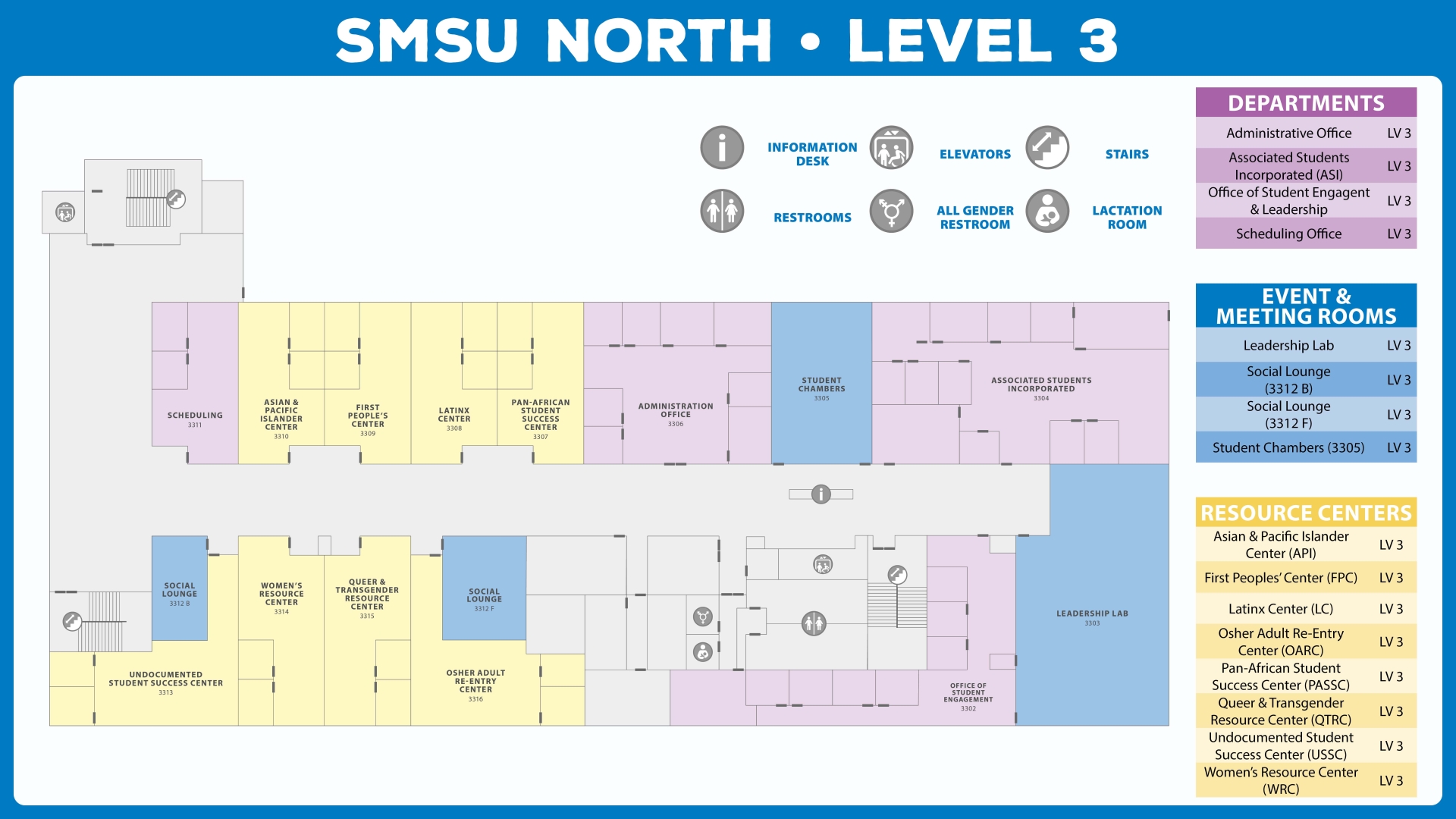
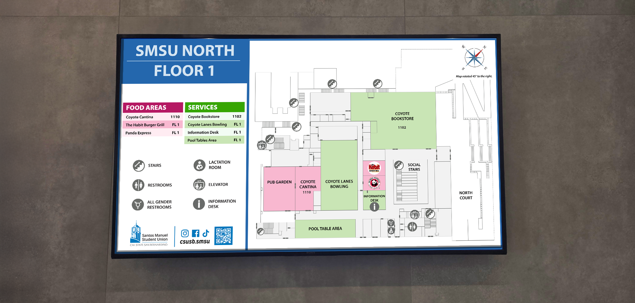
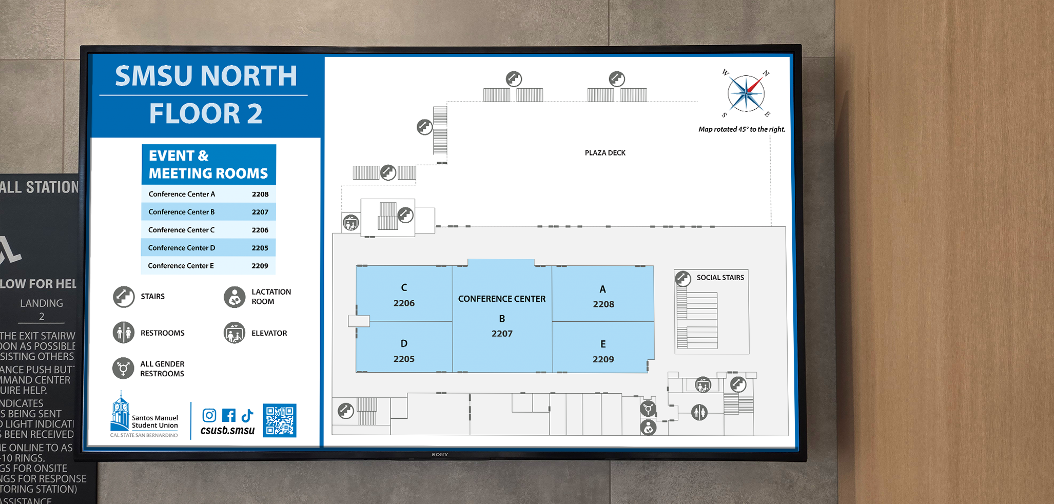
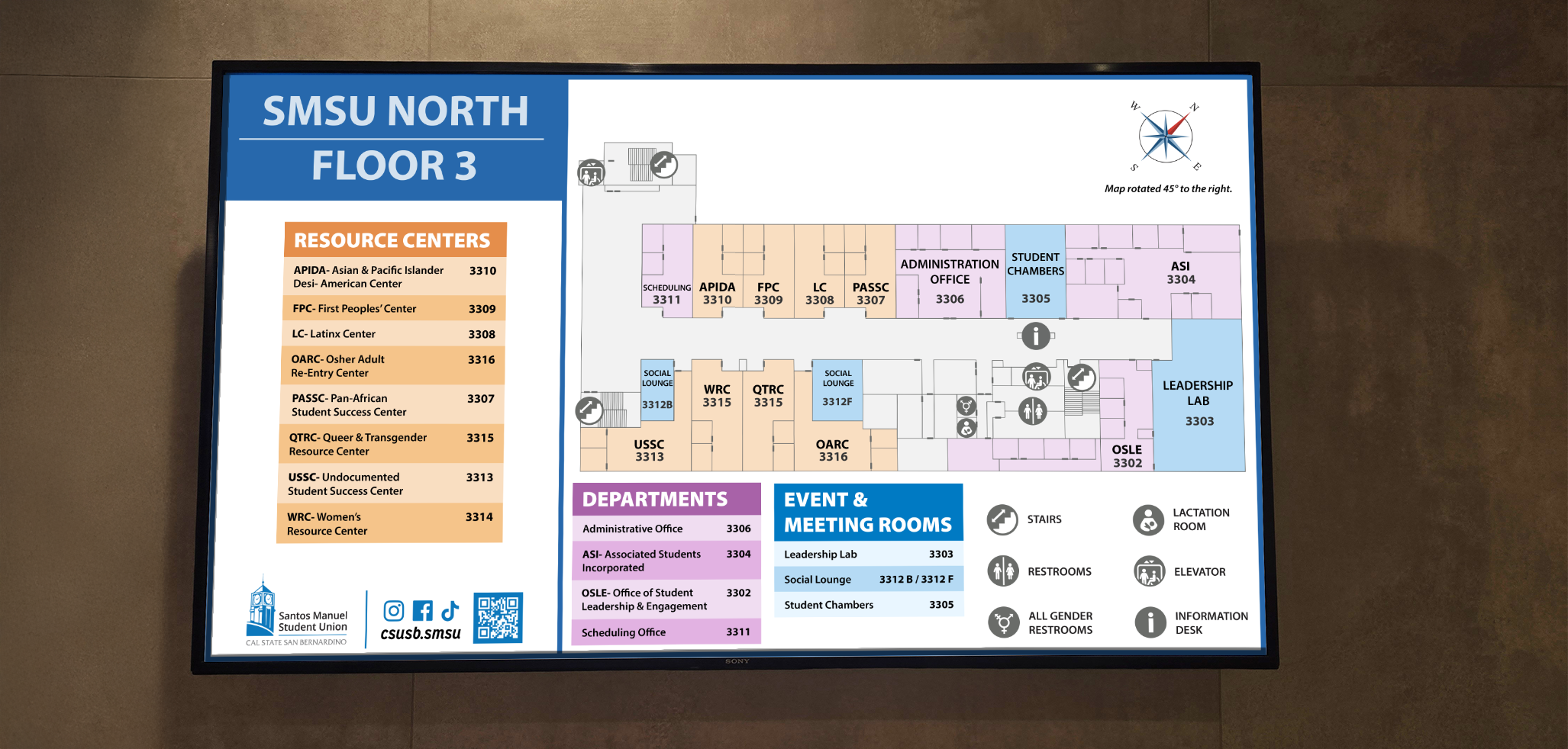
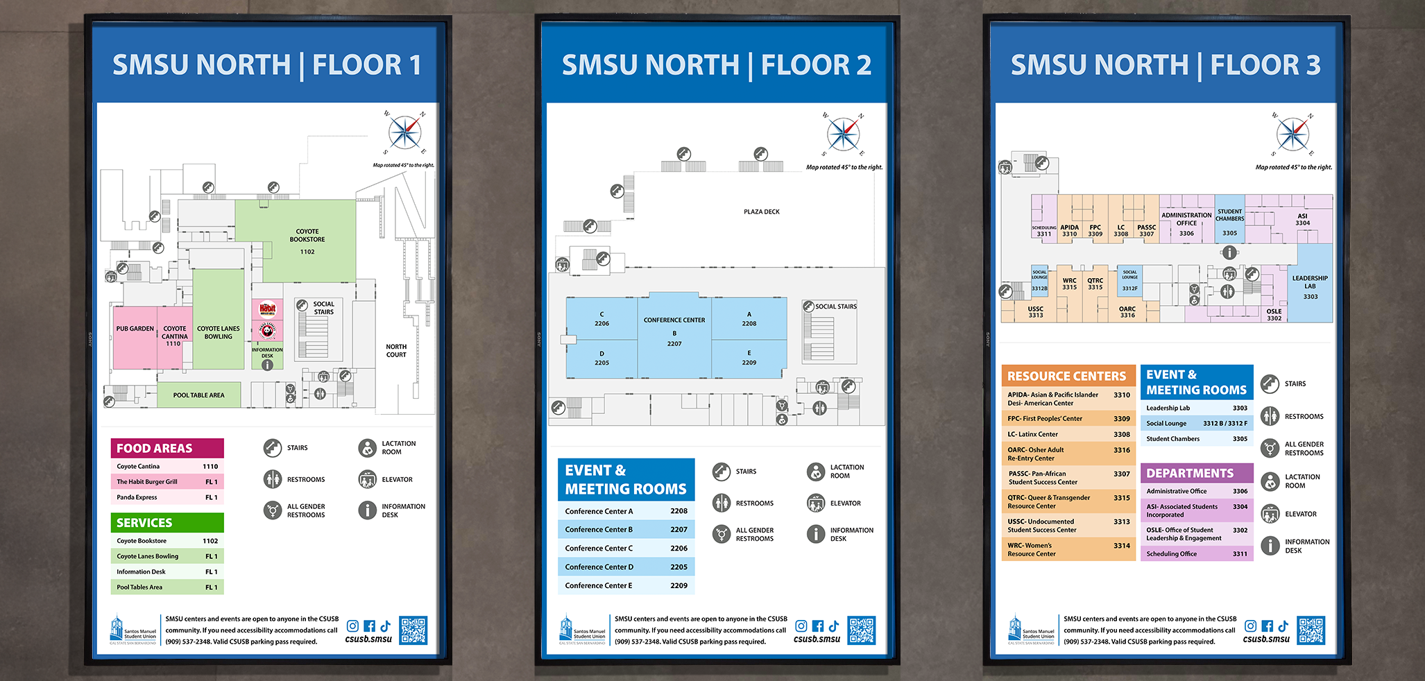
SMSU North
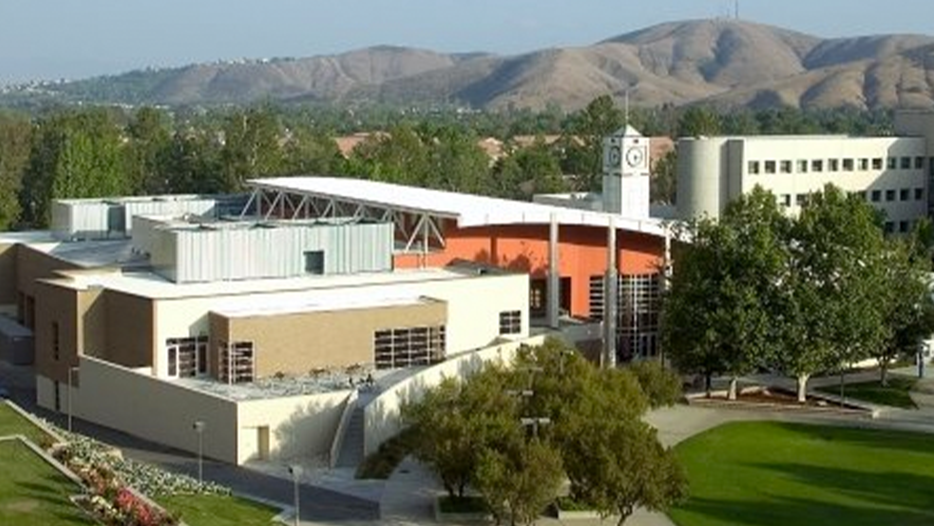
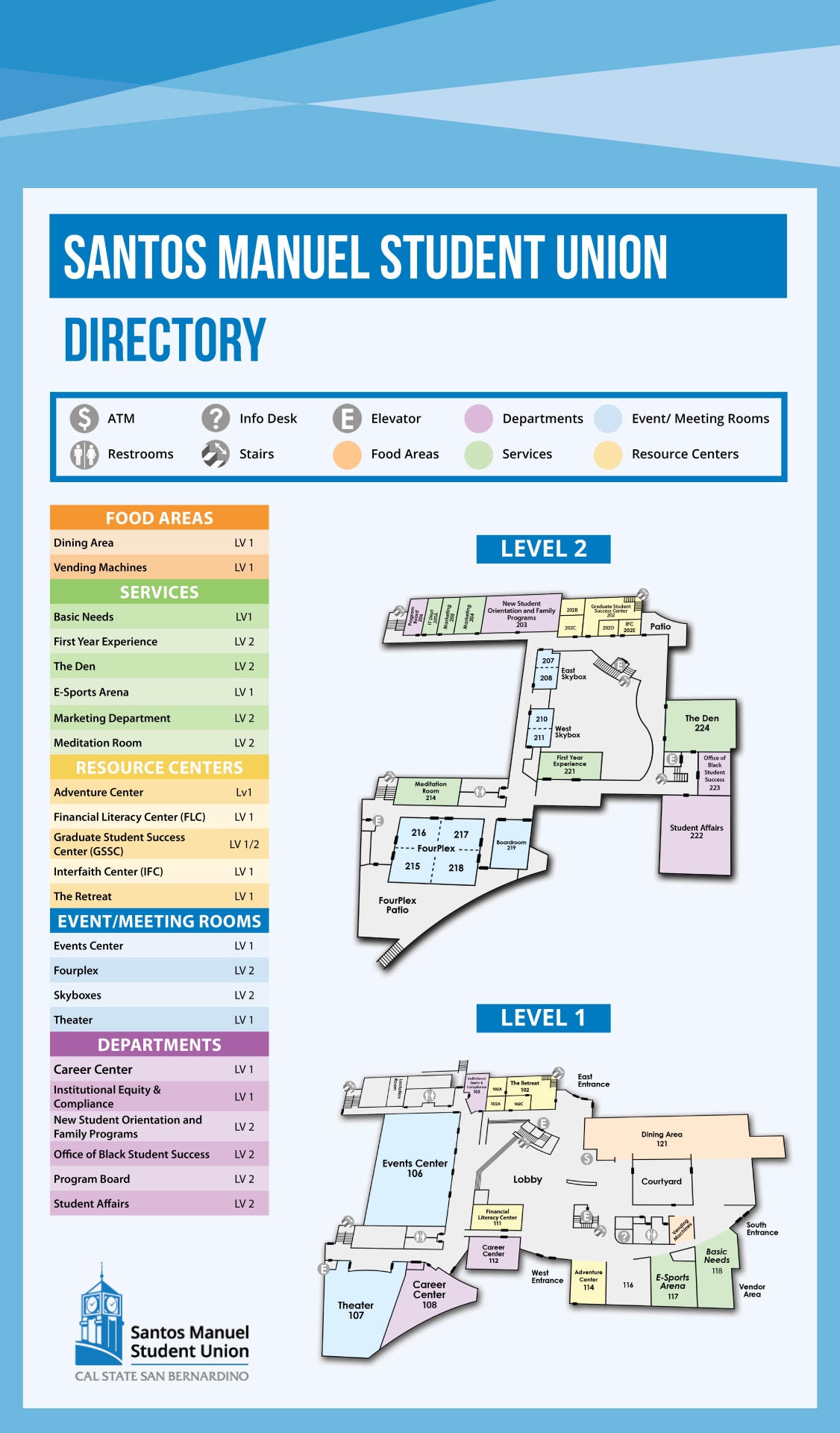
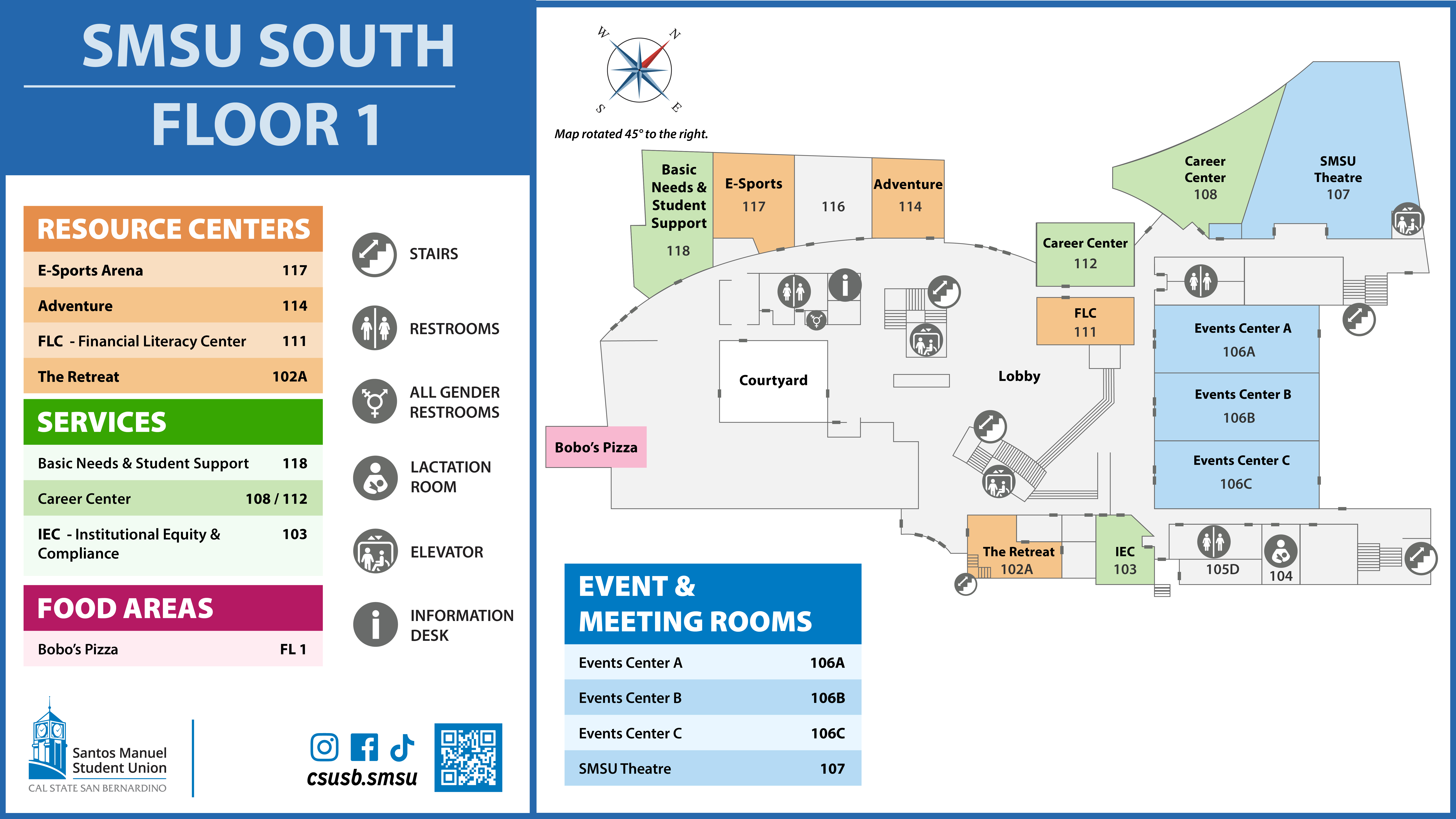
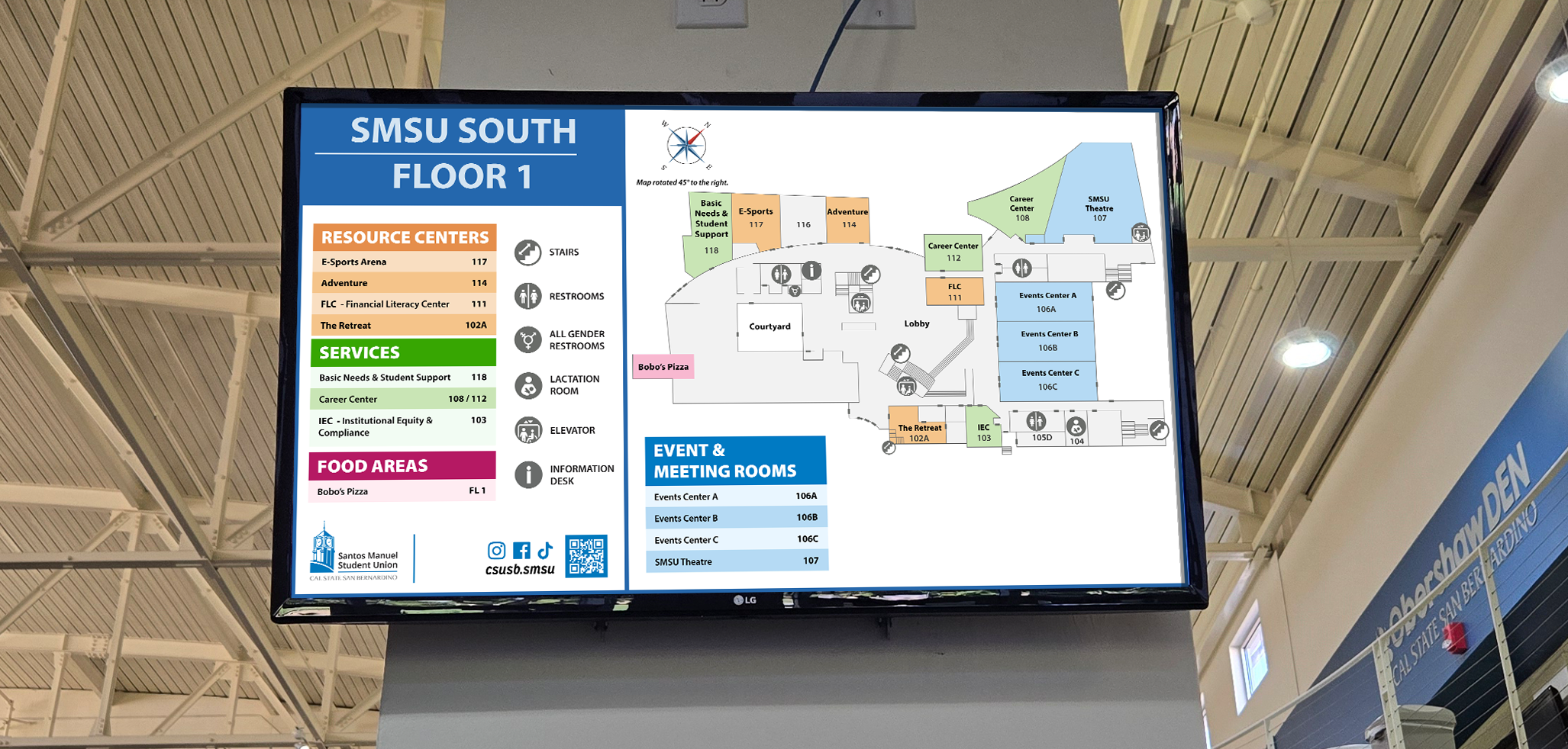
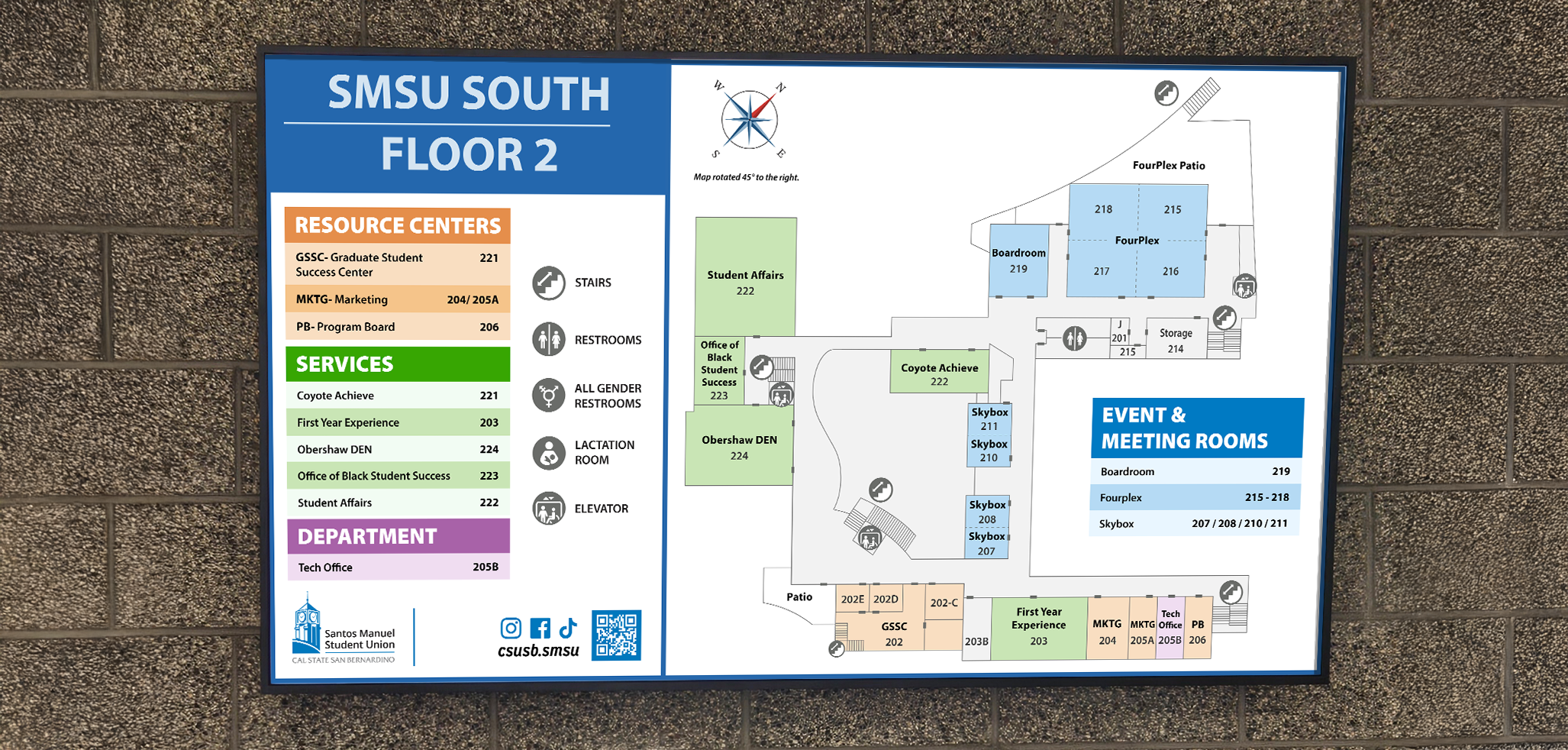
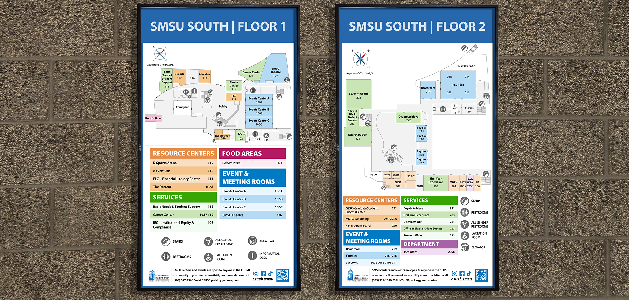
SMSU South
Overview
The Santos Manuel Student Union (SMSU) at California State University, San Bernardino (CSUSB) consists of two primary buildings, SMSU North and SMSU South. Each building serves thousands of students, staff, and visitors. The existing floor maps were outdated, inconsistent, and challenging to navigate. This created frustration for first-time students, staff, and visitors and limited the effectiveness of the university's wayfinding system.
The project aimed to improve the legibility, usability, and connection between the buildings with a modern, cohesive map system.
Each of the five redesigned maps uses the same schematic layout and icon system originally created for SMSU North. This approach makes navigation easier and ensures consistency across both buildings.
Maps shown above are from the original SMSU North design.
SMSU North Maps Before & After
Before
Screen, 1080px x 1920px
- Room numbers absent or implied.
- Focus split between map and key.
- No compass included.
After
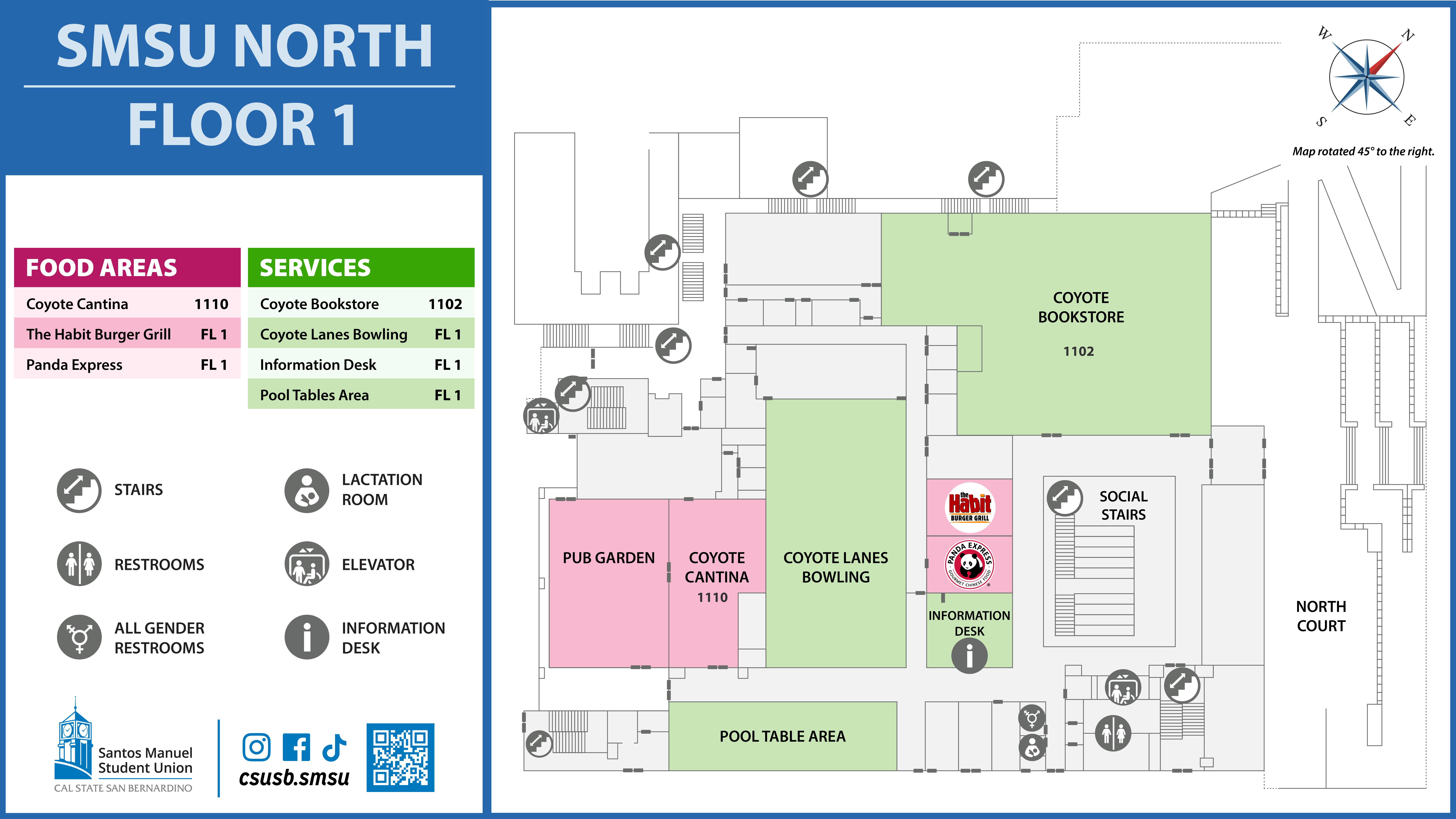
Screen, 1080px x 1920px
- Room numbers like 1102 and 1110 are now included directly on the map.
- Balanced hierarchy, making map the visual priority.
- Compass rose added with directional note.
SMSU South Maps Before & After
Before
- Both floors presented into a single vertical layout.
- No compass or orientation note. Maps pointed south.
- Dense legend and color groupings compete with map visuals.
- Legend icons only; not repeated on maps.
After
Screen, 1080px x 1920px
- Floors are separated into individual maps.
- Compass rose and map pointing close to true north.
- Clean separation of map and legend, with grouped categories and bold headers
- Icons are used directly on maps for stairs, restrooms, elevators, etc.